 Once in a while, every professional comes across a challenge so great, so ridiculous, that they just can’t help themselves. They just have to go for it. It’s like the story of David and Goliath… if David was just bored and Goliath wasn’t threatening his entire nation. As for me, I’m about to argue for putting sounds on a website, and discuss how to do it right.
Yeah, I know… I’m one of the “Never Ever Autoplay Sounds on Your Site” people. Even so, here we are. And I’m not going to cheat by talking about embedded video, podcasts, or Soundcloud wrappers. I’m also not going to talk about background music or even just ambient background sounds, because all of those are still evil, in my opinion.
Even looking for examples about sites with sound done right is nigh-impossible, because all of the search results are either music-focused examples, or articles about how you should never, ever use sound.
But as much as it rankles me to admit it, there are cases for adding sound to your websites and apps…on occasion…in very specific cases…look, I will not be held responsible for any customers you might lose, okay? This is an intellectual exercise, and it should go without saying that whatever you do, there should be a way to turn it off forever.
The Case for Adding Sound
Notifications and Alerts
Few things let you know that you should be paying attention like a fairly high-pitched noise. Teachers have their fingernails on the chalkboard, phones have their ringtones, and cats and babies use very similarly pitched sounds specifically to drive us mad/get what they need from you. Interface and product designers made use of this principle long before personal computers were even a thing. It’s effective.
I think these are only acceptable for chat conversations, or for notifications that users specifically request. When you’re waiting for information, and you need to pay attention the moment it arrives, an alert sound might well be appreciated.
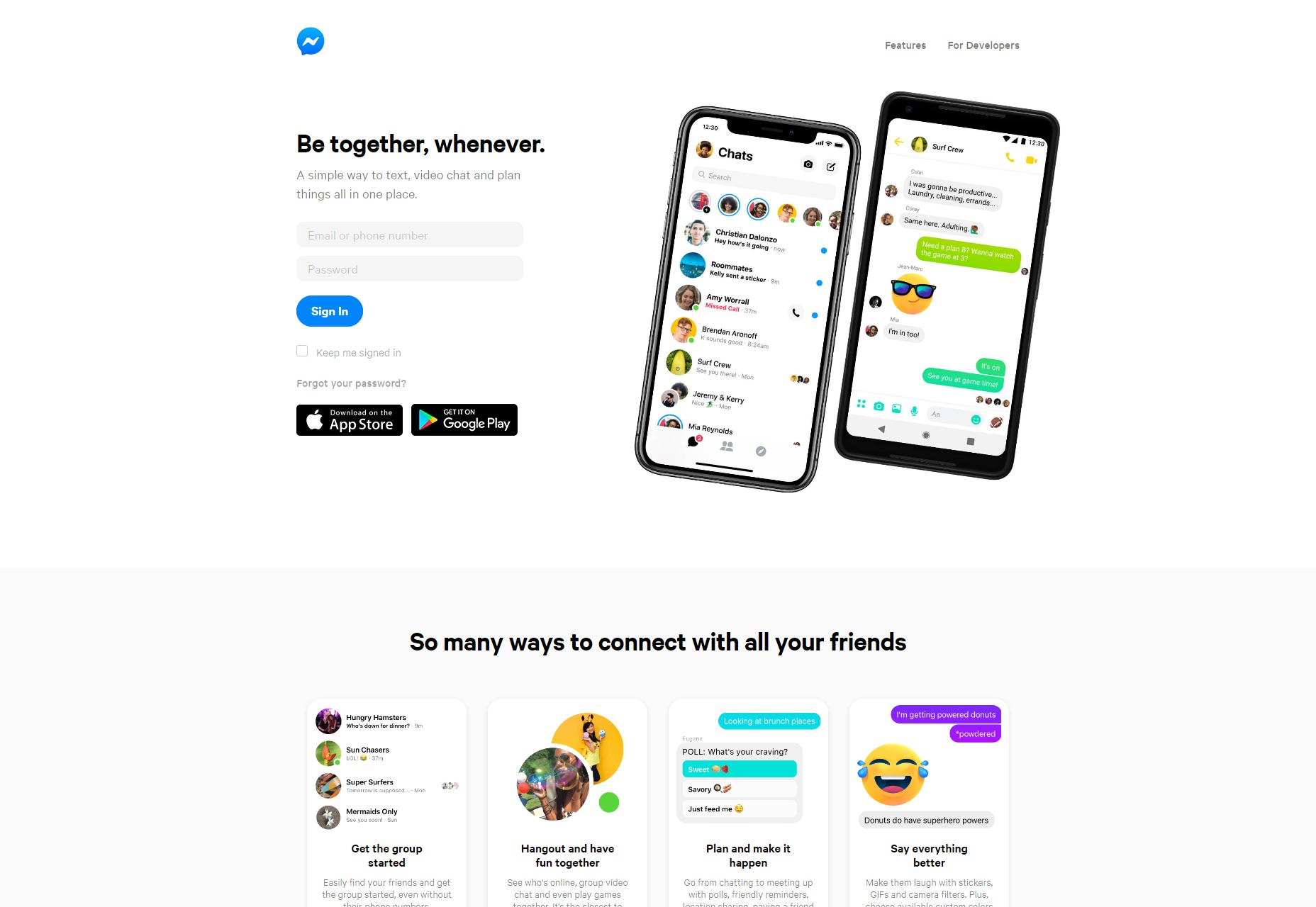
Examples include everything from Facebook Messenger and Slack, to news aggregators, to dating apps of all kinds.
Success Alerts
One pattern we might use a little more in our web and app design is actually a little bit of sound to tell people things went right. Those of us gamers, at least, often have fond memories of victory music that played every time you won a battle, or completed a level. If you can find a short “success” sound that evokes nostalgia and a dopamine hit instead of just annoying people, you may have a winner.
Accessibility Enhancement
Alert sounds are all well and good, but what about using the power of audio to help people with, say, sight problems? Sure, there are screen readers and such, but if you know that a large portion of your user base have vision problems, you might consider giving them optional audio cues to make things easier.
Think of “clicking” sounds on buttons, a tone that changes pitch when you use click and drag on a slider, a general sense of haptic feedback that might usually be represented by animation. To people with poor vision, sound is a very useful form of skeuomorphism.
Artistic Experiments
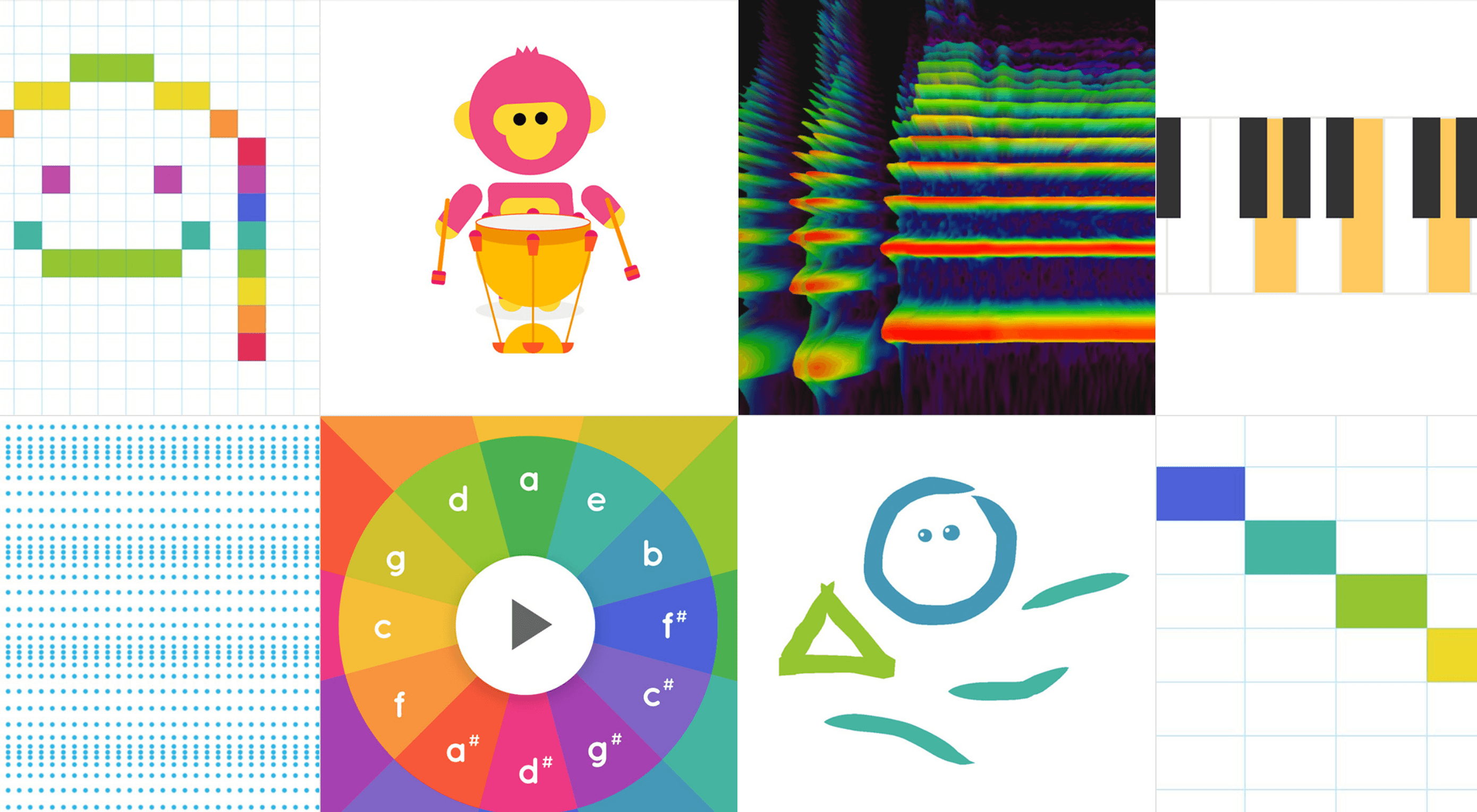
And then, of course, we have the sort of thing that might be in the “experimental” section of your portfolio, or on your CodePen profile. Here’s a site full of them: Chrome Music Lab.
General Tips for Implementing Sound
Actually Playing the Sounds
JavaScript is sort of the only way to do it. Sure, you can just embed a sound with HTML5, but that will only provide you with an audio player. If you’re trying to integrate sound into your UI in a more functional way, JS is the only way to do it. I mean, sure, technically we still have Silverlight, but who’s going to go back to using plugins?
If you’ve never intentionally added sound to your own page before, or just aren’t that familiar with JS, here’s how to play a sound on click. Now, that’s all well and good, but what if your users are having trouble finding the buttons to click on them in the first place? You might want to look at this tutorial from CSS-Tricks about how to play sound when someone hovers over an element.
You Still Have to Try Not to Annoy People
Always, always, always give people a way to shut sounds off, for good. The next question is, of course, whether you should have sound on by default. My vote? No… well, in most cases. Again, if you expect to have a lot of visually impaired people on your site, you might consider making sounds play by default, and putting in a big “You can turn these sounds off off, please don’t run away!” notice front and center.
And Lastly…
Sound files can, depending on their quality, hit people real hard, right in the bandwidth. Use a CDN for your bandwidth, and cache the heck out of any sound files for the sake of your users’ bandwidth. Next, have a look at at Aural style sheets, and think real hard about how your site is presented to screen readers.
And would you look at that? I’ve just about convinced myself that sound on the Internet is a good idea. I should probably stop, now.
Source


No comments: