With the digital world growing fast, creative mobile and website designers need to keep pace with it. And when UI designer tries to submit a pixel-perfect design mockup to the user and finds that during production it appears to be completely different, nothing is worse than this for a designer.
Not just this, designers also face constant issue related to the structure of their design.
One of the easiest ways to achieve a structured and organized design for better UI is by applying a grid system.
A grid is like an invisible glue that connects the design elements even when they appear physically apart. While grids and layout systems were since heritage designs, they’re still relevant in this multiscreen world.
The fundamental part of the style guide –
Grid build symmetry in the design elements that help deliver a better product. Grids are a framework to speed up the designer-to-developer workflow, allowing developers to pre-set classes in codes to be compatible with column sizes, this helps in reduction of time required to build a website as well as inconsistent implementation.
The grid in design terms is used to help layout elements on the page and screen. It is the concept of an imaginary plane with horizontal and vertical lines on the page or screen. We will find a lot of things around us that are designed using the grid system like a bookshelf or the tables in Microsoft Excel. Also, Barcelona’s district architecture used the grid to the layout of the neighborhood.
Whether complex or simple, all grids have common in them –
- Format
- Margins
- Columns and alleys
- Modules
These common elements can be combined in diverse ways to form distinct types of grids likewise – the items placed in a general grid system are pushed around on the plane area to make it look like broken.
These unexpected pushing boundaries and experimenting asymmetry of designs have become a trend these days. This trending technique is used by the creative designers to outstand the crowd and draw attention.
There are four standard layouts of the grids which are – manuscript grid, column grid, modular grid, baseline grid.
Grid system in digital product design organize elements on the page and connect spaces.
Interaction designs with Grids –
Users don’t stick to a single device in search of a product. Despite screen sizes, designers must organize product and its content in a way that fits all. Interaction designs are fluid designs that do not have a fixed size and have changed the perspective of the grid system.
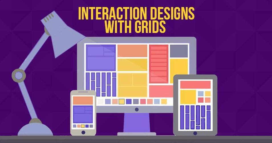
A layout grid is preferable for interactive designs as it underlines each component response to different breakpoints as well as the structure of a design, this type is faster and easier to design for multiple screens and resolutions.
Grid systems improve the quality of design, aesthetically and functionally and efficiency in several ways –
- Creates clarity and consistency.
- Improves design comprehension.
- Makes responsive.
- Quickens the design process.
- Makes the design easier to modify and reuse.
- Facilitates collaboration.
Grid is used to create symmetry and break the page in proportional sections. Approaching grid as a set of guidelines opens up the opportunity to try something different while maintaining a solid foundation.
Thus, these are some of the most effective ways to break out of the grid –
1. Pull Quotes
This trending design type is pulling out new possibilities to pop users eye. Pull Quotes lets you use diverse alignments, typeface, weights, formatting, and sizes that make UI element an excellent grid-breaking effect.

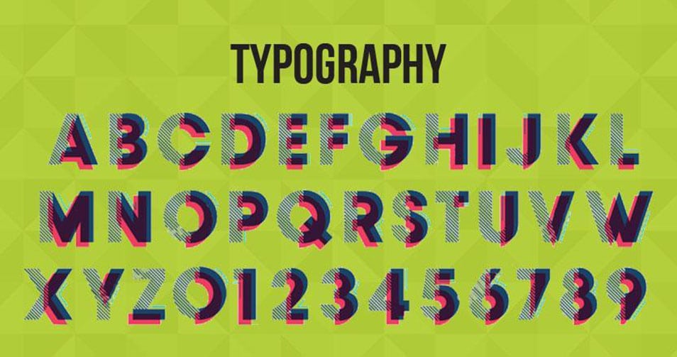
2. Typography
Typography has set its foot in designing trends too especially Sans Serif. Designers do not miss a chance to play with different font styles, sizes, margins, spacing, line heights, and alignments. Typography adds style to your design maintaining its elegance and structure.
3. Whitespace
Designing trends have changed from crowded screen to minimalism where less content and more of whitespace looks elegant. Thus, designers are focusing on whitespaces when designing interactive designs.
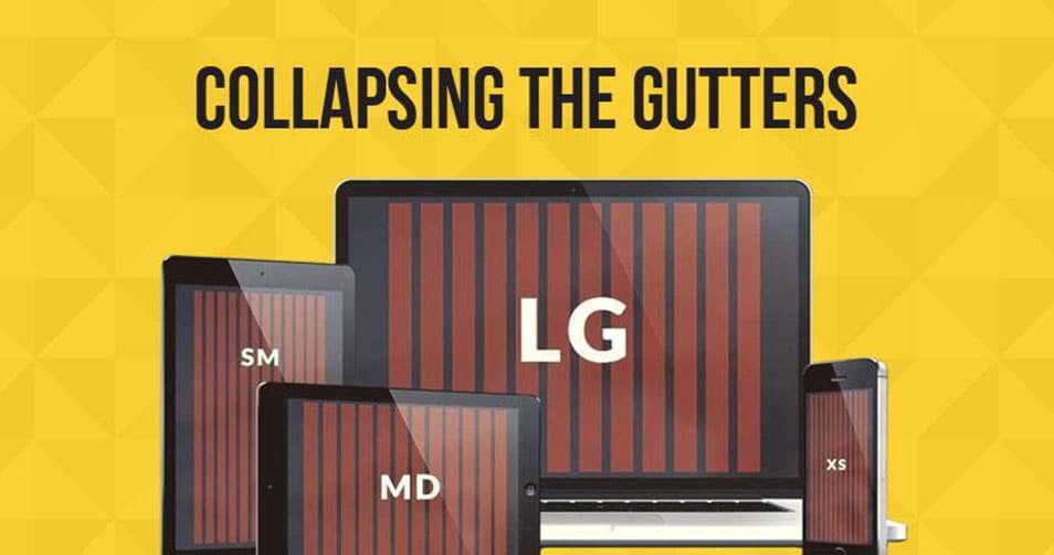
4. Collapsing the gutters
The most popular interactive designs use a grid system that has gutters in them. They make designs breathe creating proper space between columns. Collapsing these gutter gives a break out the view while maintaining structure and organization.
5. Parallax Scrolling
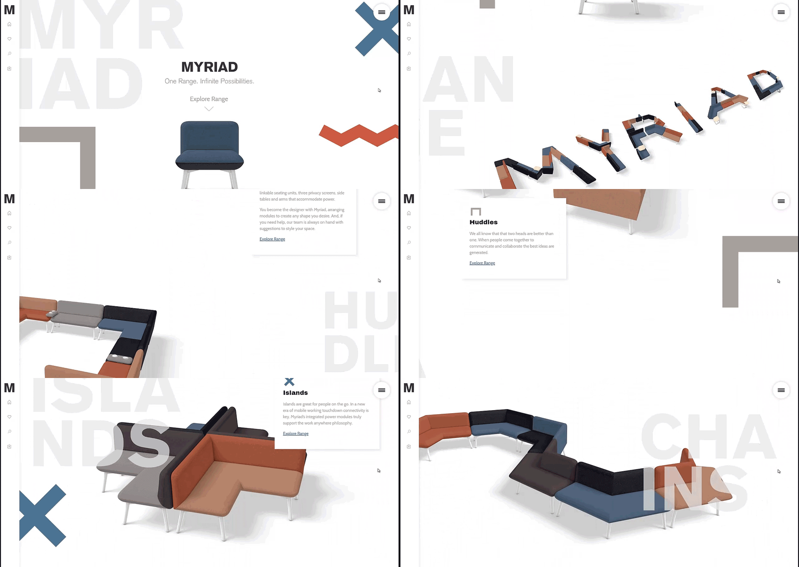
Designers are using the modular grid system for interactive designs. These modular designs of horizontal grids can be interrupted using the parallax scrolling. Parallax Scrolling is used when a designer wants to give the 3D effect of a product when a user scrolls down the page. The background of the web page appears moving while maintaining the focus on the content.
Most designers agree that a solid grid system is a foundation of a good UI design. They can’t do without a grid system because they understand that not having a grid system will cause a problem in the design process.
State of grid system in UI designing tools –
Designing tools like Photoshop and Sketch have offered basic grid functionality like snap-alignments and guidelines. Moreover, UI designing tools must consist of:
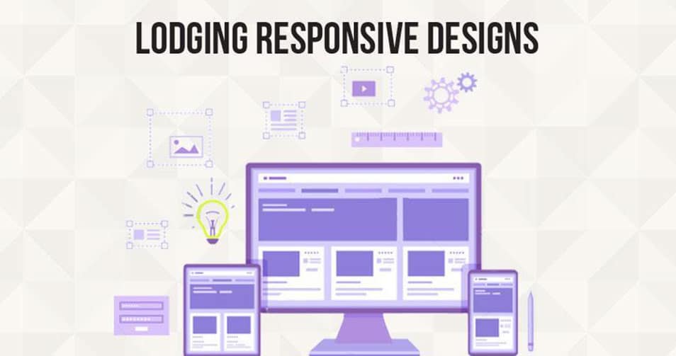
1) Lodging responsive designs –
To make the grid easy to understand and work with different screen sizes and orientation, UI designing tools should allow designers to specify grid dimensions along with the pixels. This would help in building quick and responsive grids without heavy calculations.
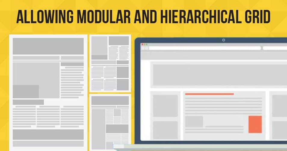
2) Allowing modular and hierarchical grid –
Where column grids cover most use cases but, sometimes it is required to use a 2D or nested grid system for designing. This designing type is used newspaper layouts, masonry layouts as well as interfaces with forms and schedules.
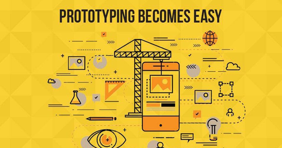
3) Prototyping becomes easy –
As mentioned above accommodating responsive designs helps in saving time required to do calculations. Designers get ample time to experiment with different design ideas and concepts at the beginning of the project.
In the Nutshell –
The grid system is used to keep symmetry and break the page in proportional sections. But a broken grid and asymmetrical layouts has turned the conventional grid system a new structure and is trending giving designers the freedom to showcase their creativity.
Breaking the grid or asymmetry in the layout does not mean that you are waving off the alignment. Understand, that grid is a network of lines that cover the artboard and designers can part UI elements. Also, adding subtle techniques like animation lets you break the grid and add some dynamic effect to your project.
The post Build Dynamic Mobile/Web UI with these 5 Grid Systems appeared first on CSS Author.

With the digital world growing fast, creative mobile and website designers need to keep pace with it. And when UI designer tries to submit a pixel-perfect design mockup to the user and finds that during production it appears to be completely different, nothing is worse than this for a designer. Not just this, designers also […]
The post Build Dynamic Mobile/Web UI with these 5 Grid Systems appeared first on CSS Author.
[Collection]UI Design
No comments: